You are using an out of date browser. It may not display this or other websites correctly.
You should upgrade or use an alternative browser.
You should upgrade or use an alternative browser.
Feedback Requested on 2014 Hat
- Thread starter jbeletti
- Start date
- Status
- Not open for further replies.
happykraut
Well-known member
I like the yellow black, but yellow gets dirty too fast and the "N" on hat 3 is hard to read. So #2 is my choice.
Herbiesrig
North Central Region Directors-Retired
We like hat #4 as mostly because of the new painted rigs...They match
Ray LeTourneau
Senior Member - Past Moderator
I originally voted for #1 but Now I see there's a 4th option. I like #4 as well. For me the 2 small emblems on the visor and another larger on the crown of Cap 2 seem repetitive.
Rottiesmom
New York Chapter Leader - retired
I'm a blue girl #2 it is - Don't like Yellow feel like a bumble bee TEE HEE
davebennington
Senior Member
Management has spoken Yellow please.
dave
dave
happykraut
Well-known member
Judi likes the pink visor.
kowAlski631
Well-known member
I like pink (breast cancer awareness). Martha
Paul & Martha
Life's too short. Live so you can say "Remember when" not "I wish I had".
Paul & Martha
Life's too short. Live so you can say "Remember when" not "I wish I had".
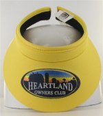
I'm hearing 50/50 on the colors over here and the Facebook feedback is about the same. Seeing no feedback here on the logo size. Some on Facebook feel the logo is too large. I tend to agree. I asked about a smaller version and was told it would lose resolution/detail.
What if we used 3D stitching to stitch...
Heartland
Owners Club
...in a single thread color that contrasts well with the visor color?
What if we used 3D stitching to stitch...
Heartland
Owners Club
...in a single thread color that contrasts well with the visor color?
jmgratz
Original Owners Club Member
Re: Feedback Requested on 2014 Visors
Sheila says she like the yellow, she already has a pink one.
iHey Ladies,
What are your thoughts on these 2 "clip-on" style visors?
View attachment 28341 View attachment 28342
Sheila says she like the yellow, she already has a pink one.
Phil Smith
Retired South Carolina Chapter Leader
Re: Feedback Requested on 2014 Visors
Becky voted for the pink but like yellow too.
Becky voted for the pink but like yellow too.
Hey Ladies,
What are your thoughts on these 2 "clip-on" style visors?
View attachment 28341 View attachment 28342
jassson007
Founding Louisiana Chapter Leaders-Retired
DW does not care for either color but would go for yellow. She would prefer black one but no big deal. She did say logo size looked fine to her
Sent from my iPhone using Tapatalk
Sent from my iPhone using Tapatalk
katkens-DW
Founding Illinios Chapter Leader-retired
I like the pink to but agree with Kristy it needs to be a darker pink. Kinda looks pale to me.
- Status
- Not open for further replies.
Similar threads
- Replies
- 3
- Views
- 387
- Replies
- 6
- Views
- 247
- Replies
- 0
- Views
- 416
- Replies
- 2
- Views
- 632


