Landmark Louisville....almost here!

Status
Not open for further replies.

iforget

New Jersey Chapter Leader-retired
Other than not being able to get to the refrigerator or bath without putting the slide out, my biggest complaint would be the slide in sofa. We have it in out 2010 Cyclone and we hate it!! Without really looking those would completely put me off from buying it. There are so many ideas as how to shorten the Landmark 365 etc and those ideas should be considered
 

porthole

Retired
I would not even walk in to look at a 5th wheel that had my sitting area encroached on by a slide out like this.
An no dinettes for us either.

Bathroom and Fridge access with slides in is also a must.
 

danemayer

Well-known member
Given that there's a floorplan provided by Andy, and a different one provided by Oregon_Camper, I'm wondering which drawing which comments apply to.
 

Oregon_Camper

Well-known member
Given that there's a floorplan provided by Andy, and a different one provided by Oregon_Camper, I'm wondering which drawing which comments apply to.


Excellent Point....
I have gone back and added ** This is not a real layout....Just one I created for fun **"to each of my posts.

- - - Updated - - -

I would not even walk in to look at a 5th wheel that had my sitting area encroached on by a slide out like this.
An no dinettes for us either.

Bathroom and Fridge access with slides in is also a must.


I'm guessing you mean the outdoor seating area on door side. If so...I am 100% in agreement.

- - - Updated - - -

O... my biggest complaint would be the slide in sofa. We have it in out 2010 Cyclone and we hate it!!


Are you referring to the 2 lounge chairs?
 

travlingman

Well-known member
This is in response to Andy's floorplan and announced changes:

Negatives:
  • Don't like the slide in slide being on the door side. As stated there is no place to set, have to walk around, this is a cut head waiting to happen. Will have to crawl under this slide to access storage for chairs, etc.
  • Queen bed, not a king.
  • No access to fridge with the slide in.
  • The new steps. You will have to clean before folding in. In a rainstorm you will be putting wet steps inside the camper. There have been times at stops that I have had to get into the camper without using steps because of lack of space to put them out. Will not have access to camper with these new steps in that situation.
  • Don't even understand the kitchen. You have the pantry on the opposite side of the stove, the sink on one end, and an island. At least you will get exercise while you fix something to eat.
  • I like the idea of a booth dinette, just not in the location you have it.

Positives:
  • 22" deep drawers in bedroom.
  • 40" TV outside not in the storage compartment.

Sorry , but I think you missed it on this design. As some have said, it is obvious that whomever designed this doesn't RV.
 

BusManRG

Well-known member
Wow I hate to be negative when I haven't seen the unit yet. It may be a beauty, but one more observation. Landmark just recently dropped a floor plan that was only around 35 feet long. This new "shorter" Landmark is over 37 feet!

Sandy
 

jayc

Legendary Member
changingI'll chime in with a suggestion for dining. Do away with this plan with the dinette in the couch. Without having seen it, I imagine it will be a cross between a booth dinette as seen in a popup and something like a toyhauler with holes in the floor for the table leg to be supported. Not my idea of a luxury trailer.

If the plan is to eliminate the dinette (innovative), do that. Eliminate it completely and add some nice upscale-looking TV trays that could also be used as a lap tray. Incorporate a method to secure the trays to the arms of the chairs or theater seats so we could eat in the recliners. Make a tray that could also be used for a laptop.

Build a nice tasteful bracket or area to secure the trays for storage and travel next to the pantry.

If you're thinking of changing the steps to the new Mor Ryde steps, please look at the Glowstep Revolution steps. They fold up like conventional steps but when extended, give the stability that we all want.
 

For20hunter

Pacific Region Directors-Retired
OK...You asked for it. :cool:

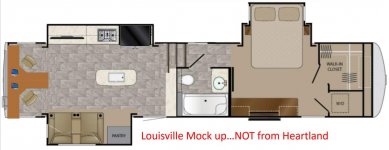
I've updated the floor-plan a bit, with a complete 180 from the stairs to the front of the coach. I feel this makes for a cleaner look from the "camp side" of the coach. I am not a fan of the bed coming out into the "camp side" of the campground.

I also moved the sink back to the island, as that is where the food will be prepped and dishes naturally go there. (IMHO of course)

By moving the bed to the driver’s side, this really opens up the door side of the coach for a big awning for shade and to keep me dry during our PNW "liquid sun" days.

Finally, I moved the outside TV forward a bit, to line up with the TV in the bedroom. This is my idea/effort to bring cabling together.

** This is not a real layout....Just one I created for fun **

View attachment 50257
I like that much better that way!!

Hopefully the factory is not too far along in the design part of the project to be able to switch it. This makes much more sense to me that having it on the patio side. JMHO

Rod
 

jlsr

Member
I like that much better that way!!

Hopefully the factory is not too far along in the design part of the project to be able to switch it. This makes much more sense to me that having it on the patio side. JMHO

Rod

I'm disappointed in Heartland's plan. Agree that Oregon camper's version is much better. Was really hoping for a 35 footer. The one we have is 37' so no reason to change at this point. I was really hoping for the 4 slides like the silhouette showed.
We don't care for the dinette in a couch either.

Oh well..
 

Jesstruckn/Jesstalkn

Well-known member
I'm really surprised that they didn't present this plan a while back for everyone to give there opinion before there put it into production...
Like others have said the designers clearly are not RV'ers.
Of course you can never make everyone happy but I don't think we've see 1 post on here that has said they love it..

Sent from my XT1585 using Tapatalk
 

avvidclif

Well-known member
Whoever designed this has never camped/lived/used an RV, period.

1. Bedroom slide in the way on most used side of RV.
2. No fridge access with slides in.
3. Sink on counter not island.
4. Pantry in wrong place.
5. Etc, etc, etc.

I'll pass....

Edited to correct confusing the original with Oregons changes, it does have bath and bed access in original.
 
Last edited:

For20hunter

Pacific Region Directors-Retired
Cliff,

In Andy's plan you will be able to get to the bathroom with the slides, in, but that is about it. I am okay with the sink in the island, but I agree, the fridge needs to be accessible with the slides in, and that bedroom double slide NEEDS to be on the off door side. It is not practical the way it is designed.

Rod
 

Oregon_Camper

Well-known member
Ok....I've changed some more things (beyond the bedroom flip), based on your input and how I see my wife and I using an RV when we retire.

Change #1 - Lets face it, people are online more, and for our needs, having a "U" shaped desk area would be great. We have this desk setup in our home office and love it. So I removed the dinette and replaced it with a "U" shaped desk. This allows 2 people to be using their desk at the same time. My concept would also included a hidden section on the "arm" part of the desk, that would allow you increase the length, in case you want to have guests over to dinner. This would then be used as your table. With no guest involved the "arm" section will act as your everyday dinning table.

Change #2 - I swapped the stove and refrigerator, as just about everyone want to have access to refrigerator with slides in.

Change #3 - Included angled stairs, to allow access to bedroom and bathroom while slides are in.

Capture.jpg
 

Doublegranch

Mountain Region Director-Retired
Even with the refrig flipped, it appears the right door will still catch the edge of the island..anyone know the measurements involved?
 

Speedy

Well-known member
The best way to kill this floorplan is to show no interest and never consider the purchase. Let economics work. Then the designer or designers involved should be sacked for lowering sales and profits.

Heartland, this is your flagship product! Don't be too innovative because it can backfire on you and you'll end up spending decades to get you back to this point. (remember the Cadillac V8-6-4?) Focus on the best current floorplans and then build the highest quality coaches on the market. Listen to your customers, build what works and build it better than anyone else.
 
Status
Not open for further replies.
Top