You are using an out of date browser. It may not display this or other websites correctly.
You should upgrade or use an alternative browser.
You should upgrade or use an alternative browser.
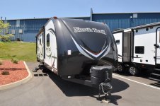
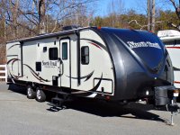
North Trail Caiber Edition front cap decals - With or without?
- Thread starter Ranchdip
- Start date
Shortest Straw
Caught In A Mosh
We do not have them on ours and I like it that way. I suppose that a couple extra decals is not that much more to take care of in the grand scheme of things.
Silverado23
Iowa Chapter Leaders
I think the stripes help lighten the load of the trailer. After all it is supposedly a lightweight trailer.
JWalker
Northeast Region Director-Retired
Man, every time I look at those pictures I cannot make up my mind. I keep going back-and-forth. The Northtrail logo itself looks very simple and elegant. I like that. But then I look at the one with the decals on the front and I like that one also. I guess I'll sit have to make up my mind. Let me see........
Ranchdip
Active Member
I think the stripes help lighten the load of the trailer. After all it is supposedly a lightweight trailer.
My thinking exactly..
GWRam
Well-known member
He is correct, the only opinion that counts is yours.
Since you asked, I like both fronts when viewed alone.
When viewing the camper including the side I would go without the additional cap graphics. I don't think the front graphics go with flowing curvey side graphics.
It could be said the straight lines of the front graphics don't follow the nice curves of the cap either.
Just thought and opinion
Sent from my iPad using Tapatalk H
Ranchdip
Active Member
The one opinion that counts is yours.
Yeah, I'm on the fence about it because I don't have a creative eye for this stuff. I wanted to go ahead and pick up the decals before they discontinue them. Not sure if I'll immediately put them on there or not. I could go either way. If I had an overwhelming reponse to add them I would do it immediately....not so sure now. I might save the $75 and pass on it all together.
Ranchdip
Active Member
He is correct, the only opinion that counts is yours.
Since you asked, I like both fronts when viewed alone.
When viewing the camper including the side I would go without the additional cap graphics. I don't think the front graphics go with flowing curvey side graphics.
It could be said the straight lines of the front graphics don't follow the nice curves of the cap either.
Just thought and opinion
Sent from my iPad using Tapatalk H
You bring up a good point. To me, I think the late 2014/early 2015 graphics on the cap look like an afterthought. Maybe add the "Caiber Elite" and "by heartland" text only?
View attachment 35386
Shortest Straw
Caught In A Mosh
I am guessing that you do not really like the lack of front cap graphics? Maybe just the two outside ones might work and leave the two colored V out of the middle?
Ranchdip
Active Member
That's a thought for sure. I just was thinking the sides of the trailer were busy with decals and they left the front a little bare. I'm not overly excited with the decals Heartland choose to bring it all together on the front cap though. I think the late model 2015's are the best looking but that decal pattern is different than my 2014.
Shortest Straw
Caught In A Mosh
You noticed that too... On another forum I am on there were over 6k views and only about 25 of those made a comment on the question. I do not get that, especially on this forum where we are all supposed to be proud Heartland owners willing to help each other. With that said, have you made a decision?
Similar threads
- Replies
- 6
- Views
- 1K
- Replies
- 3
- Views
- 782
- Replies
- 22
- Views
- 990
- Replies
- 0
- Views
- 408


