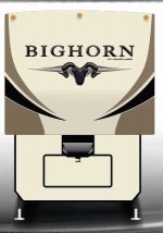
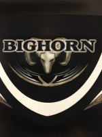
Feedback requested on Two Bighorn Front Cap Concepts

Which of the two Bighorn Front Cap "Concepts" do you prefer?

  • Concept 1 - I like this one best of the two

    Votes: 58 43.3%
  • Concept 2 - I like this one best of the two

    Votes: 76 56.7%

  • Total voters
    134
  • Poll closed .

jbeletti

Well-known member
This poll is being posted for Tom Montague, the GM for the Bighorn product.

Tom is looking would like anyone and everyone to vote in this poll.

Poll Question: Which of the two Bighorn Front Cap "Concepts" do you find most pleasing?

Poll will run for 2 weeks. Votes are anonymous.

Concept # 1
bighorn-front.jpg

Concept # 2
BIGH_D24860-R2-V8D.jpg
 
T

TomMontague

Guest
Thanks Jim - I really appreciate the post, I know you're busy with travel & rallies... Listed above are just two samples that I'm playing around with. Group/Forum feedback is always appreciated and helpful. At the end of the day I'm trying to design a product that owners can be proud of... As I get further along in the design process I would love to be able to use this group to help make important product decisions. Lets see how this first pole question goes...

My first initiative might be to freshen up the logo... What do you think? Please vote above.


Excited to see the results.

Thanks,
Tom
 

Noofear

Well-known member
This poll is being posted for Tom Montague, the GM for the Bighorn product.

Tom is looking would like anyone and everyone to vote in this poll.

Poll Question: Which of the two Bighorn Front Cap "Concepts" do you find most pleasing?

Poll will run for 2 weeks. Votes are anonymous.

Concept # 1
View attachment 43333

Concept # 2
View attachment 43334
I have a 2015 big horn and I like concept 1

Sent from my SM-G920V using Tapatalk
 

Niles

Well-known member
Well I goofed meant to vote for 1 and hit 2 by mistake. Two looks like a cow skull to us. We have a 2008 BH and it's close to the same as two, so something fresh would be nice.
 

MTPockets

Well-known member
I like the #1 graphic better than #2, but the word Big Horn is way too large... Actually, I like the Mountain Graphic on the front of our 2012 Big Horn better than either of these two.
 

cookie

Administrator
Staff member
A logo design change always keeps the product line fresh. However, going to far away from a previous recognized logo may not be the best thing.
I voted for #2 as it looks like something I recognize.

Peace
Dave
 

TandT

Founding Utah Chapter Leaders-Retired
I like number one, but number two looks more classy. More like Landmark. Trace
 

TravelTiger

Founding Texas-West Chapter Leaders-Retired
A logo design change always keeps the product line fresh. However, going to far away from a previous recognized logo may not be the best thing.
I voted for #2 as it looks like something I recognize.

Peace
Dave

As a graphic designer I agree with Dave.

The first one is too much of a departure, the second is not a graphically pleasing shape (sorry, I see something that is not a bighorn head.)

Erika


Sent from my iPhone using Tapatalk
 

JWalker

Northeast Region Director-Retired
As a graphic designer I agree with Dave.

The first one is too much of a departure, the second is not a graphically pleasing shape (sorry, I see something that is not a bighorn head.)

Erika


Sent from my iPhone using Tapatalk

Erika,
The first design puts me in mind of the first Elkridge logo. The Elk in the mountains.
 

TravelTiger

Founding Texas-West Chapter Leaders-Retired
Erika,
The first design puts me in mind of the first Elkridge logo. The Elk in the mountains.

Yes, I can see that a little bit. I never cared for the change from that, to the side-angle head-only Elk. Now there's no elk at all.

A silhouette of the bighorn in the mountains is a big departure from the graphic head only.


Another thing is that I'm wishing it wasn't ivory background. Maybe silver/gray/blue tones, something not used on other lines.

Sent from my iPhone using Tapatalk
 
T

TomMontague

Guest
Thank you everyone for the votes and feedback. I know from experience people tend to really like what they have and are generally afraid of what something "might" become. I can also tell you from experience that given time, most people like the "new" versions better than the old once they've had time to digest and look at the package as a whole. I would think most people weren't too excited about the new LM365 but today it's sold more than ever and is the #1 selling Luxury fifth wheel in the business. Im really hoping that Bighorn sales take a similar path only on a much bigger scale. Just so people remember. This is what the current graphics look like. This head doesn't look much like a ram either. It's hidden behind the logo which makes it extremely hard to read at a distance. Driving down the highway for instance and passing it. I want people to be able to read it. Not recognize it - those folks who recognize it are already are owners - I want "new" prospective customers to read it and then do research on it. I also am looking to freshen up the design and to use the actual logo inside the coach and on marketing material to create more brand awareness. I want something that looks great as a backsplash, a spice rack, headboard, toilet seat cover, embroidered on a bath towel or on a Heartland Owners jacket. These are examples - not necessarily things I'm doing :)
 

Noofear

Well-known member
Thank you everyone for the votes and feedback. I know from experience people tend to really like what they have and are generally afraid of what something "might" become. I can also tell you from experience that given time, most people like the "new" versions better than the old once they've had time to digest and look at the package as a whole. I would think most people weren't too excited about the new LM365 but today it's sold more than ever and is the #1 selling Luxury fifth wheel in the business. Im really hoping that Bighorn sales take a similar path only on a much bigger scale. Just so people remember. This is what the current graphics look like. This head doesn't look much like a ram either. It's hidden behind the logo which makes it extremely hard to read at a distance. Driving down the highway for instance and passing it. I want people to be able to read it. Not recognize it - those folks who recognize it are already are owners - I want "new" prospective customers to read it and then do research on it. I also am looking to freshen up the design and to use the actual logo inside the coach and on marketing material to create more brand awareness. I want something that looks great as a backsplash, a spice rack, headboard, toilet seat cover, embroidered on a bath towel or on a Heartland Owners jacket. These are examples - not necessarily things I'm doing :)
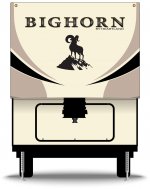
Have you thought about placing the logo on the MCD shades

Sent from my SM-G920V using Tapatalk
 
T

TomMontague

Guest
That's a new one... I haven't but I do have an idea for the Day/Night shades that I'm pretty sure people are going to love. Sorry for deleting my post but I couldn't get my computer or my phone to download the picture of the front cap graphics of the current Bighorn. I will repost once I can figure that out...

Talk soon,
Tom

Picture added for Tom by Jim B
IMG_0634.jpg
 
Top