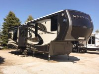
Feedback requested on Two Bighorn Front Cap Concepts

Which of the two Bighorn Front Cap "Concepts" do you prefer?

  • Concept 1 - I like this one best of the two

    Votes: 58 43.3%
  • Concept 2 - I like this one best of the two

    Votes: 76 56.7%

  • Total voters
    134
  • Poll closed .

BusManRG

Well-known member
That's a new one... I haven't but I do have an idea for the Day/Night shades that I'm pretty sure people are going to love. Sorry for deleting my post but I couldn't get my computer or my phone to download the picture of the front cap graphics of the current Bighorn. I will repost once I can figure that out...

Talk soon,
Tom

Picture added for Tom by Jim B
View attachment 43338[/QUOTE


I voted for concept two, but this has been my favorite. Simple, classy, elegant. My issue with any of the designs would be to keep the ram's head from looking too much like a skull.
 

wdk450

Well-known member
No vote on the graphics, but I have seen SOB 5th wheels here at the So Cal Thousand Trails RV parks with front caps that fold up with support rods on the sides to allow a window in the front of the rig (if this isn't patented).
 

Chippendale

Well-known member
Maybe it is just me, but if I am purchasing a luxury 5th wheel to possibly live in, I would hope that the designers would get more of their ideas, both interior and exterior, from HGTV instead of Barnum and Bailey. I wouldn't be real big on seeing company or brand logos in my living room or kitchen. In fact, it would more than likely keep me from purchasing the RV.
 

mytruc

Member
We missed concept 3&4, but would like to say that the #4 concept really looked good. We voted on #2 in the beginning. We have a 2012 bighorn and have always liked the front cap
 

TravelTiger

Founding Texas-West Chapter Leaders-Retired
12513918_10206602716969025_4250188517975770469_o.jpg

Well, If this is what the Bighorn has to compete against, a new look is probably in order. This doesn't look like the Montana of old.
 

BudnDonna

Member
I like #4 , but since it's almost the exact same as the Big Country front I prefer #2 or the original .

Sent from my SM-T700 using Tapatalk
 

jmgratz

Original Owners Club Member
I think #2 looks too much like the Dodge Ram logo and could invite a lawsuit from Dodge. I personally like the one in use now.
 

happykraut

Well-known member
Bummer, no idea how I missed the poll. Perhaps a new poll is in order showing all four concepts with some of the ideas incorporated that have been brought up in this poll.
 

pegmikef

Well-known member
I guess, like Bernie, I was sleeping or something when this poll came out. I would have gone with 1 as I think it is a more definite silhouette of the animal itself
 

Bohemian

Well-known member
I would like a graphic more like the one attached here.
 

Attachments

  • Screenshot_2016-03-20-12-16-37.jpg
    Screenshot_2016-03-20-12-16-37.jpg
    23.1 KB · Views: 32

DougS

Doug S
I just washed my Bighorn and was reminded that the only decals on a RV with full body paint is the logos and name. When we owned our LM, everything on the full body paint was painted including logo and name. I would like to see the name and logo designed so it can be painted on if you go with the full body paint option.
 
Top